
Icons for Young Minds
12/1/20243 min read


Role: Designer
2024
Team:
Brit Scott Designs
Client
Summary: I collaborated with Brit Scott Designs to create a bespoke set of 54 icons for a Coventry primary school, establishing the visual system and aesthetic. The designs were tailored for practical use, launching in the Autumn term.
Context
Brit Scott Designs approached me to work with them on the development of a series of icons to be used at a local school in Coventry. The icons were to capture different subjects and themes that students would be studying across their time at primary school.
Creating a visual system
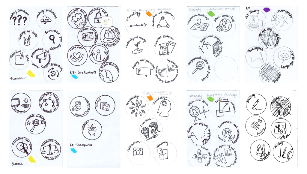
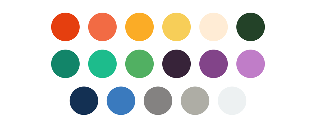
The school provided a selection of drawings, capturing the information they wanted to communicate with each icon. They were keen to have the icons different colors based on the theme or subject area they were within, but apart from that they didn't have any clear ideas on visual aesthetic or style.
The challenge here was to find a way to capture the information they wanted to communicate, have a set of different colors, whilst making sure the icon set worked as a whole.
I was also thinking about the fact these icons would be used at different sizes, sometimes large on a presentation and sometimes small in the corner of a document, as well as the fact they needed to appeal to a young audience as the school educated 5 - 11 year olds.


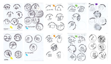
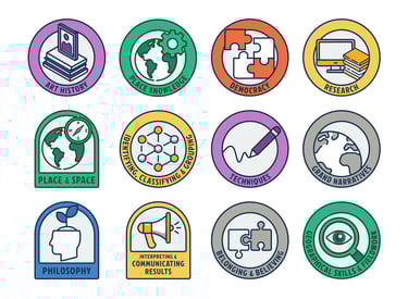
An early version of the designs, before establishing a visual system.
Proposing variation through shape
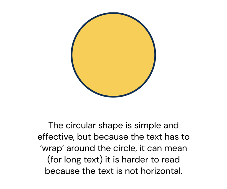
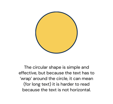
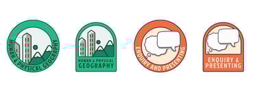
As well as playing around with colors and visual style I was also considering the best shape to use for these icons. Whilst the school had provided reference sketches that were circles, I found that with longer 'title' the text became difficult to read as it wrapped around the circle, and for young readers this could particularly be a challenge.
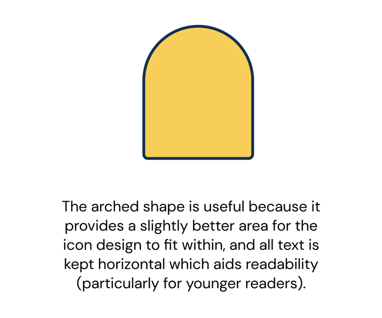
As I explored the designs, I discovered an 'arch' shape that I particularly liked, and I went back to the client to propose selecting one of these shapes (an arch or a circle) and a visual aeshetic.
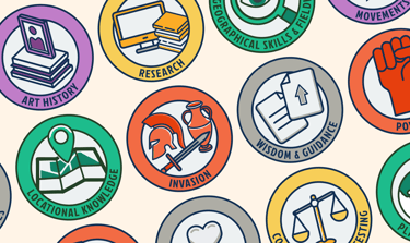
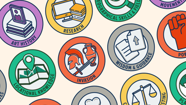
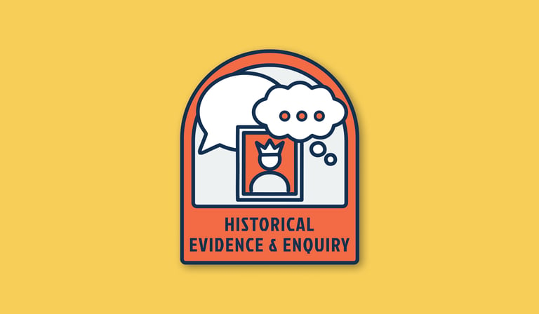
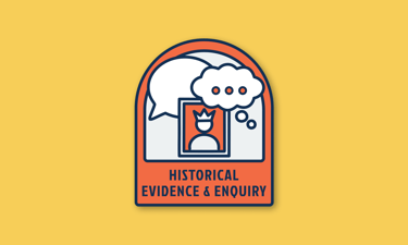
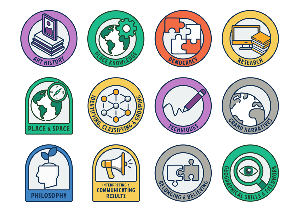
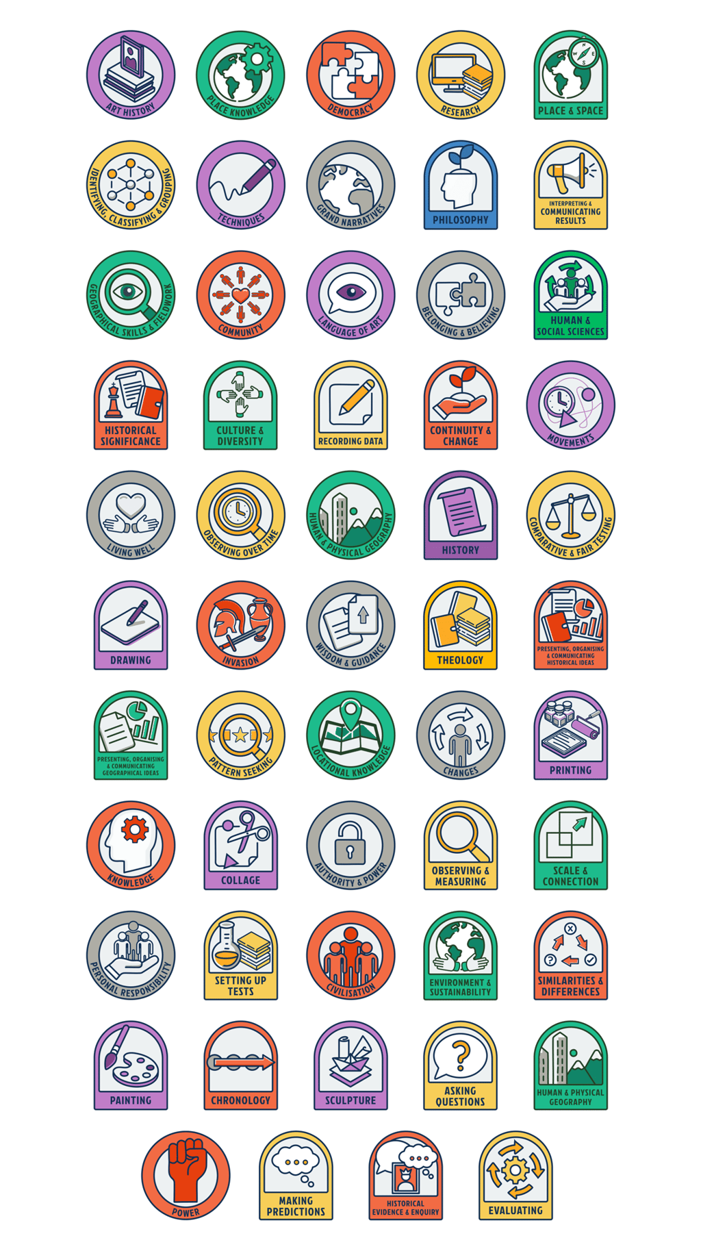
Icons for young minds
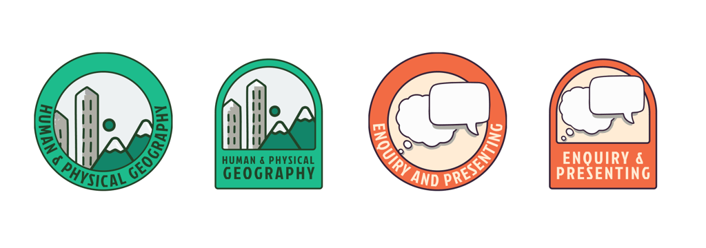
The client loved the proposed visual aesthetic and approach to the icons. Once they saw the potential with the variation of shape, they decided to really lean into that and create even more segmentation of the icons by using the circle shape for some themes while using the arch shape for others.
In essence... they wanted it all!
And I was happy to provide it for them :)
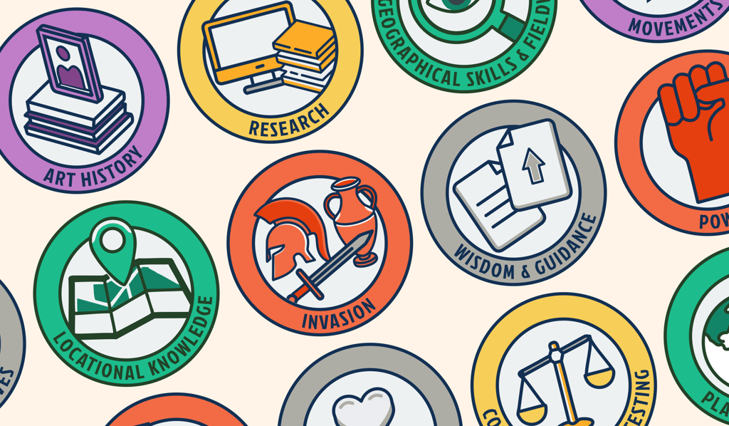
I proceeded to create the full set of 54 icons, all cohesive in style and following the visual system I'd established.


How did I do?
The client had some great things to say about the work, which I received through Brit Scott Designs:
"The Deputy Head said to me that she LOVES them and that the icons went WAY beyond their expectations. She’s so excited to show the staff and start using them. She asked me to pass on her thanks to you for them."