Designing a Better First Impression
12/1/20243 min read

Role: Product Designer, UX Manager
2023 - 2024
Team:
UX Writer
UX Researcher
Front-end Developer
Back-end Developer
Business Analyst
Solution Architect
Product Owner
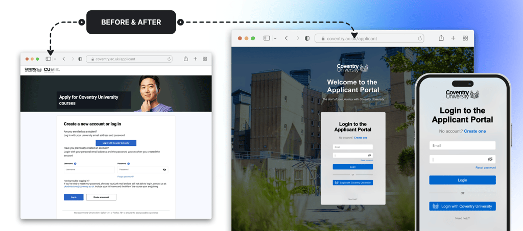
Summary: A cluttered and confusing login screen was creating friction in Coventry University’s application process, lowering applicant numbers and increasing support queries. I led a UX team to redesign the login experience, simplifying options, reducing friction, cutting support enquiries, and boosting application conversions.
Is There Really a Problem?
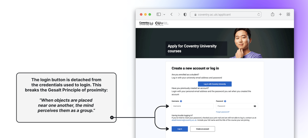
It only took one glance at the existing login page to spot the issues that needed attention. For Coventry University, applications are the primary revenue stream. Any friction in the process of submitting an application is not just a usability concern—it directly impacts the bottom line. And, of course, it was frustrating for prospective students trying to navigate the clunky interface!
We could have designed a bespoke, unique login experience unlike anything else on the internet. But would that have solved the problem?
No. What we needed was:
Ease of use: A login process that doesn’t make users think.
Familiarity: Users just want to get to their task—they don’t care about the login screen.
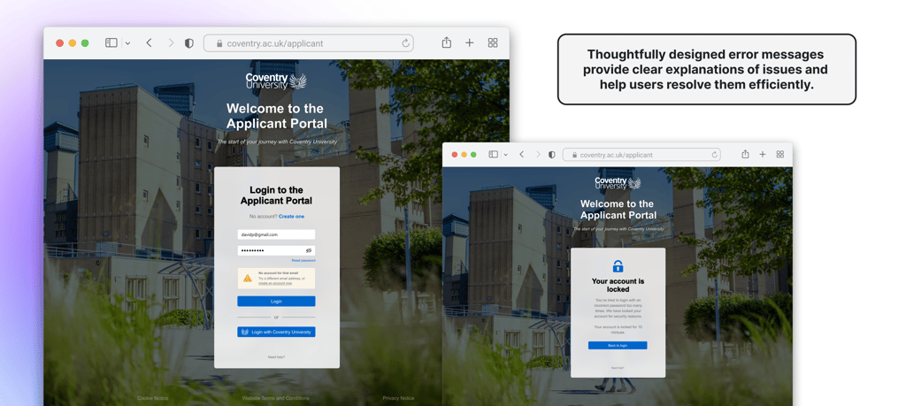
Built-in support: Self-service options to solve issues without requiring extra help.
Jakob's Law: Users spend most of their time on other sites. This means they prefer your site to work the same way as others they’re familiar with.
Laws of UX
Research: Building a Foundation of Best Practices
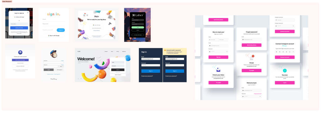
To tackle the problem, I led the UX team in desk research, analyzing login experiences from across the web. We studied layouts, user flows, error handling, and how each journey guided users effectively. This gave us a foundation of user expectations that we could adapt to Coventry University’s unique needs.
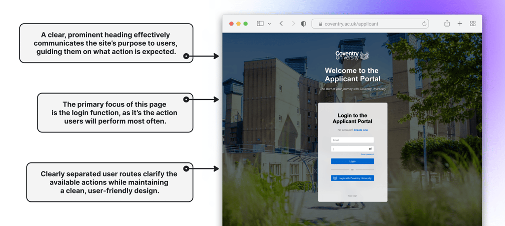
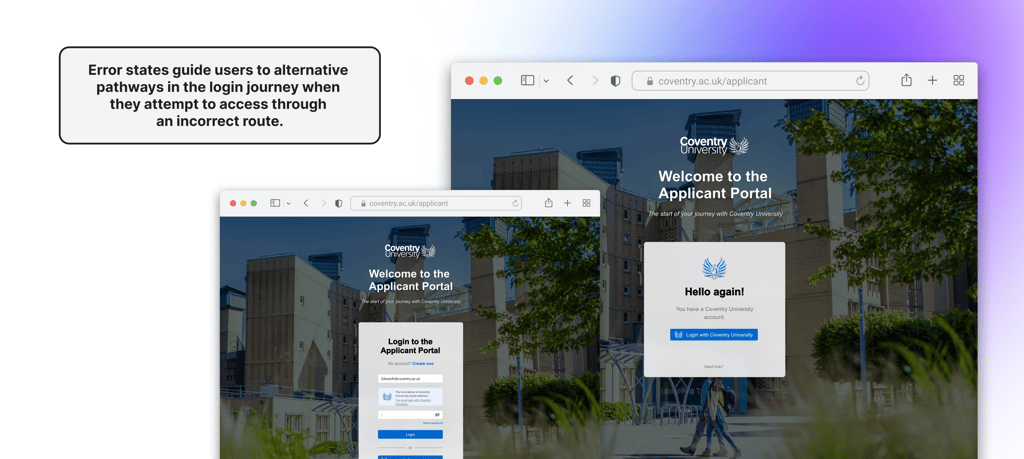
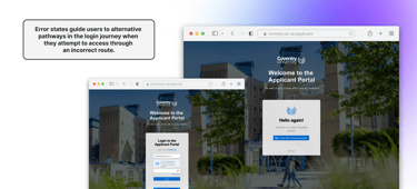
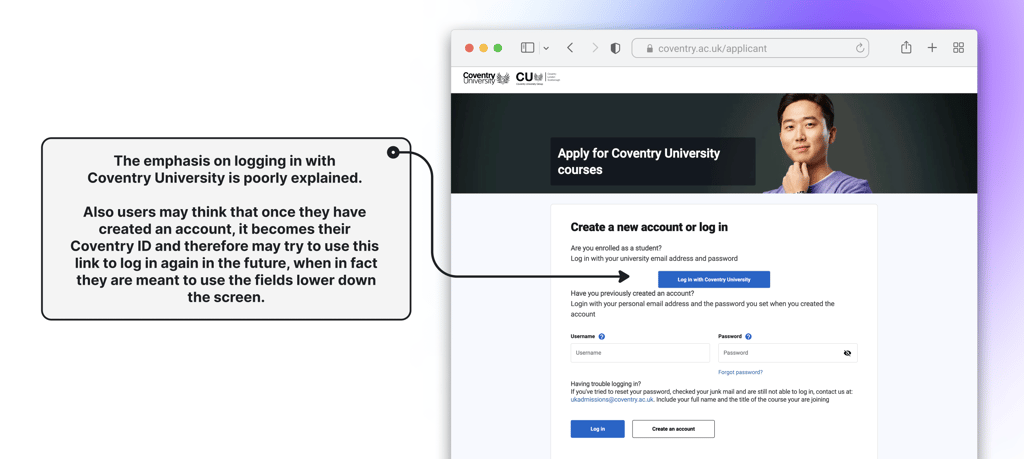
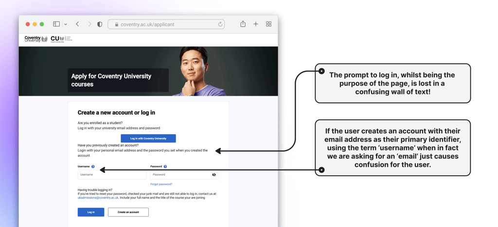
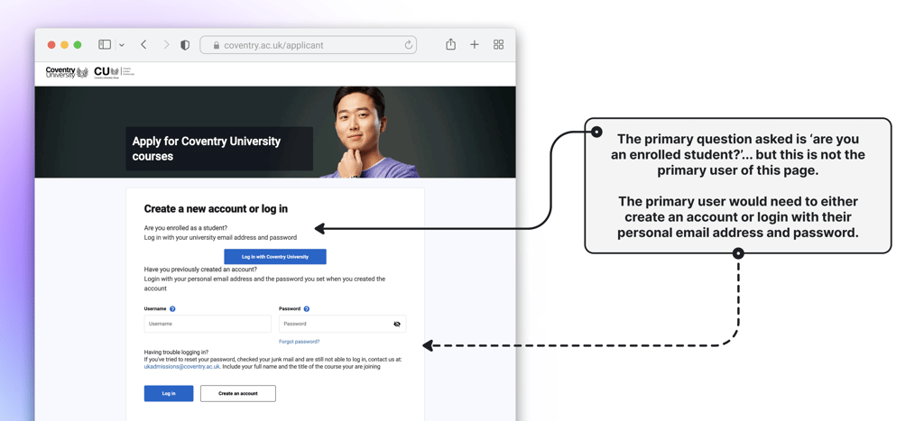
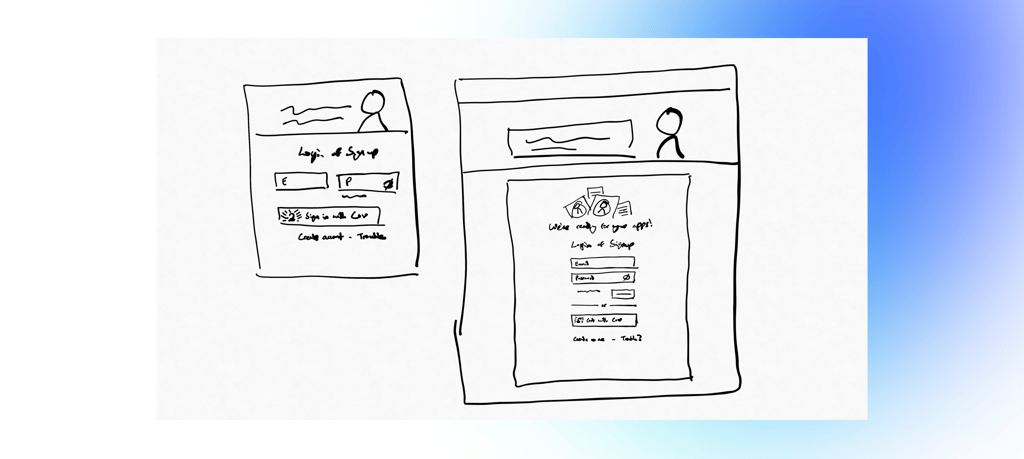
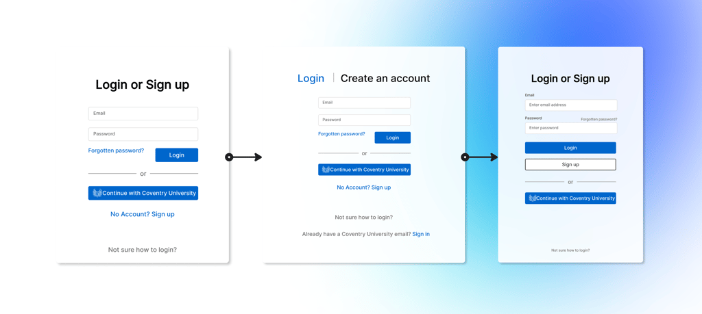
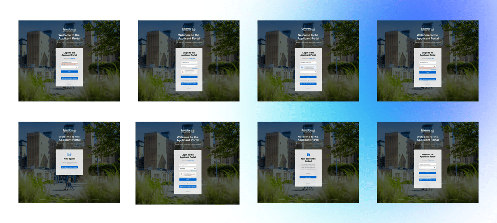
Through a UX audit of the existing login page, we identified three primary user routes:
1 - Logging in with a username and password.
2 - Logging in with an organizational email (for current students).
3 - Creating a new account for first-time users.
SOMETHING WE DISCOVERED:
Splitting "create an account" into a separate journey reduced distractions for returning users and streamlined the login process.
Iterative Design:
Collaborate, Refine, Repeat
It took many iterations and close collaboration with the UX Writer on my team to create an intuitive, logical experience. We focused on clearly separating the user routes while keeping the overall design simple and user-friendly.
Early collaboration always leads to better outcomes.
I thrive on having my designs challenged—tearing them apart and rebuilding collaboratively always results in stronger solutions that meet user needs and work technically!
As we refined the designs with Business Architects, Solution Architects, and Developers, we encountered constraints and technical limitations that required rethinking parts of the approach. These discussions also revealed edge cases and "not-so-happy paths" we hadn’t initially considered.
The UX Writer and I worked closely to ensure every route and state was accounted for, balancing clarity and functionality at every stage.
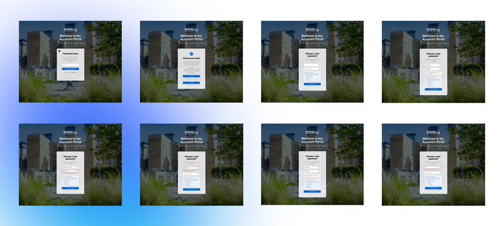
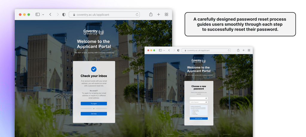
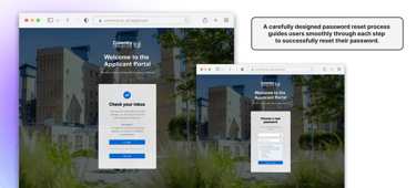
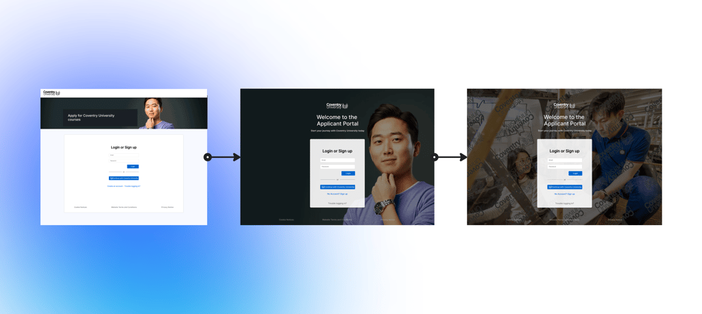
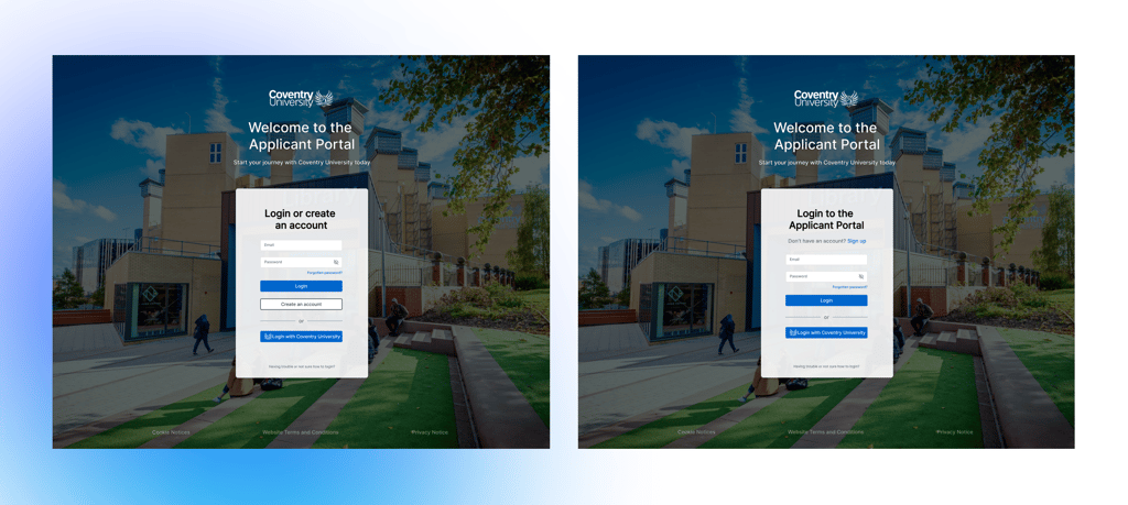
The solution:
Simple, Seamless, and Scalable
After many iterations, collaborative problem-solving, and rigorous testing, we delivered an elegant solution.