
The story behind the New Horizons rebrand
12/6/202412 min read


Role: Designer, Project Lead
2018 - 2019
Team:
Graphic Designer
Client
Summary: New Horizons is a church based in Coventry (UK) who needed a refresh on their branding for a new season of development in the church. I worked with a 'brand working group' of key leaders in the organization on the development of a brand, not just a logo; building a visual system that would serve them long into the future.
Context
This is the story behind the New Horizons rebrand — the process of transitioning from a logo that was no longer fit for purpose to a brand that can grow and evolve as New Horizons moves forward.
I worked (through my creative agency Mazo Creative) with a brand working group within New Horizons and in this post I'd like to unpack that process for you.

A Brand not just a Logo
Before we jump into unpacking that process, it’s important to note that it was very clear from the beginning that this was the development of a ‘brand’ not just a ‘logo’. New Horizons had a logo before, but the wider design language and architecture was not there. This meant that the ‘brand’ was limiting and didn’t give room for creativity in the ways it could be applied. The new branding needed to be different.
Provide a platform
When a skyscraper is built, the foundations are first laid before the rest of the building is built upon it. I saw my part in the process as providing the foundation and base layer of principles, thinking and core visual language. That foundation could then be taken by others and built upon to create a whole world that would become the New Horizons brand.
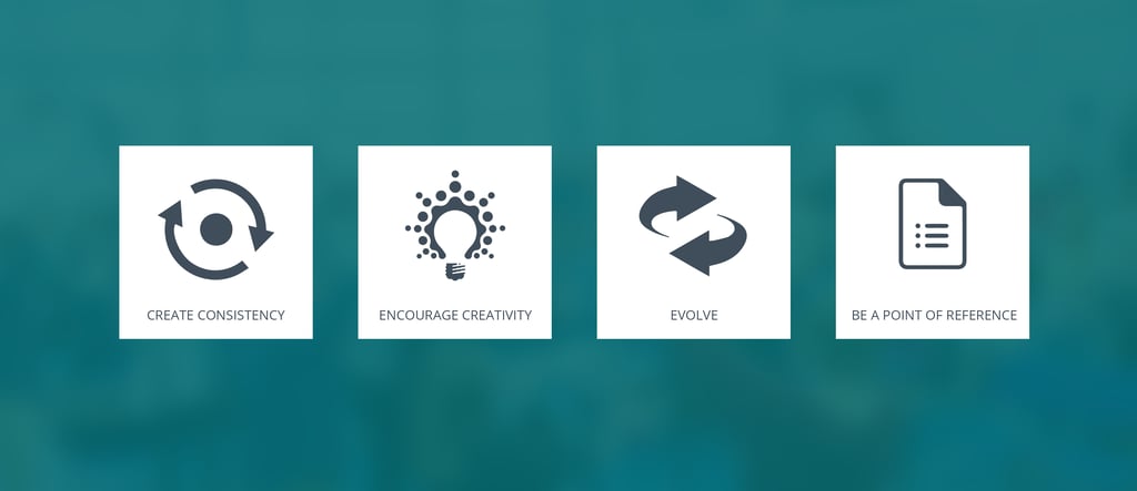
Early on, I identified that the new brand needed to:
Create consistency by being simple at its core
Encourage creativity by being accessible and easily applied by members of differing skill levels
Evolve as New Horizons journeys forward and becomes more multifaceted
Be a point of reference as the core foundation that others can build on.
Step 1: Discover core identity
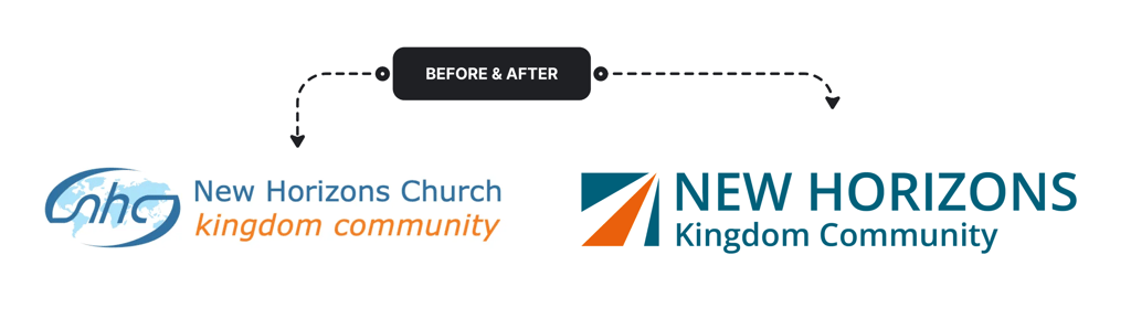
Simplifying the name
The first thing we focussed on was the name of the church itself. Up to this point New Horizons had been referred to in a variety of ways:
New Horizons Church
New Horizons Kingdom Community
… and an amalgamation of them both:
New Horizons Church Kingdom Community
Simplifying the name was clearly needed, and so the name became just:
New Horizons
Because it’s so simple, it’s then easy to add various sub-titles that refer to specific expressions of the organisation which is New Horizons (when it is appropriate to do so). So, the church ‘expression’ of New Horizons becomes:
New Horizons Kingdom Community
Giving the name significance
Out of the process of discussing the name, the term new horizons started to carry more significance. There had always been meaning and depth to the naming of the church, but by vocalising it and honing in on it, it made us more aware of what it really meant.
Therefore the name New Horizons came to represent:
God always requires newness
We are destination focussed
Our hearts are set on pilgrimage (Psalm 84)
We will always strain for what is ahead
Developing the core brand concept
Early on in the process (late 2018) I met with the brand working group from New Horizons for a 2 hour meeting where we talked about the core identity of who New Horizons is. This is where the clarifying of the name took place, as well as it being a time where we discussed the mission of the church, its core purpose, characteristics and over-arching mandate.
Out of this came a core brand concept. This concept description became the ‘moving off point’ for the next stages of the process.
CORE BRAND CONCEPT
The New Horizons brand is centred on the concept of forward movement toward a destination. The journey is progressive as we move step by step and God reveals the new horizon in front of us. It is not a random journey, but one which is characterised by clarity and precision towards the destination which is Christ and coming home to Him.
I didn’t realize at the time how significant this concept was, and how it would lead us towards not just a logo but also a new way of describing New Horizons.
Clarifying design specifics
Before moving into any actual design concepts, I also developed a list of design specifics that would help to guide the design process. These came out of the initial meeting with the brand working group and helped put boundaries around how I actually designed; making sure I didn’t go down routes that wouldn’t fit the brand we wanted to end up with.
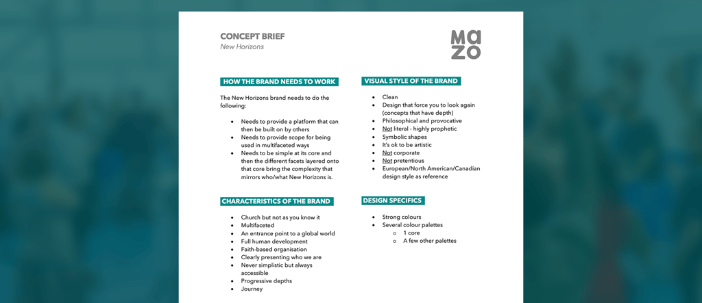
Step 2: Developing a visual identity
Developing a visual identity
Having discovered and clarified core identity, it was time to turn that into design — and the logo was our place to start.
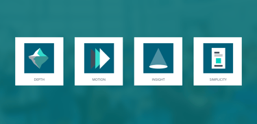
A great logo is iconic — it stands as a representative for the rest of the brand and is a condensed form of the brand as a whole. It should hold within it the principles and ideas that then outwork themselves in the wider design system and find their full expression through mixed media outputs.
Because I was designing for New Horizons, a church community, this logo also had to have a spiritual significance for the community of people who would use it as their icon. It needed to have depth of meaning that could describe the journey the church had been on as well as prophetically speak into the future of who the church would be and become.
Yet, going back to what we knew the brand needed to achieve, it had to be simple at its core — so the logo had to be the essence of simplicity while holding within it the potential for complexity.
This logo had a lot to live up to!
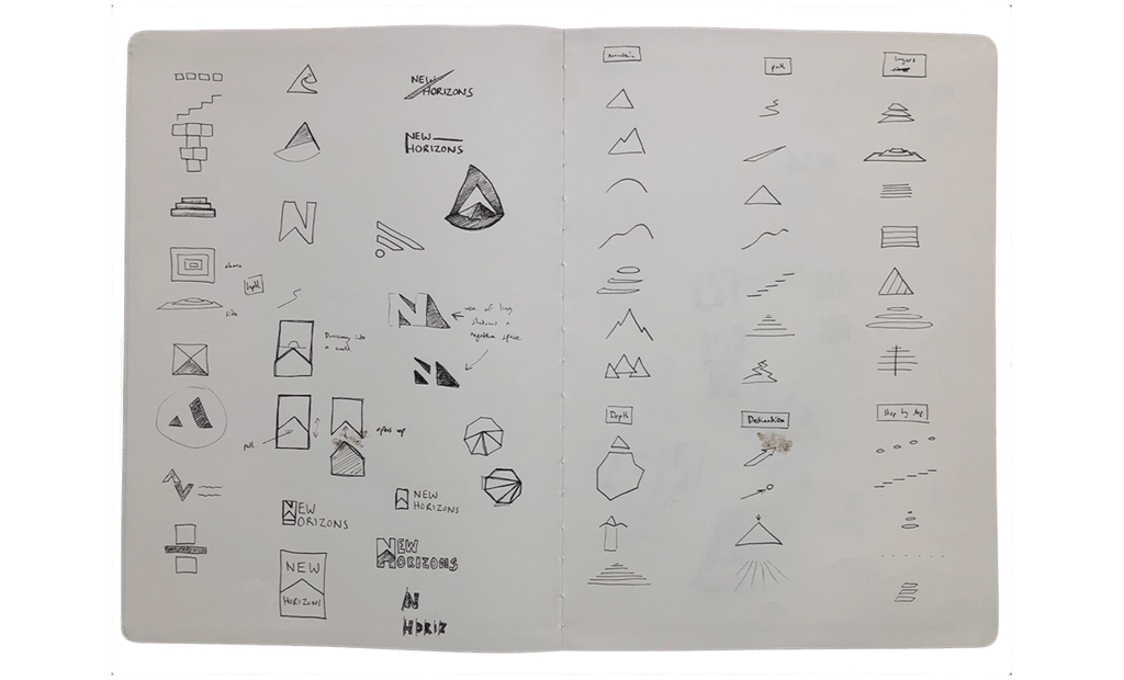
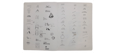
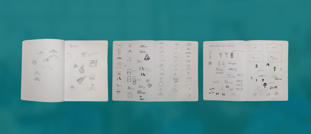
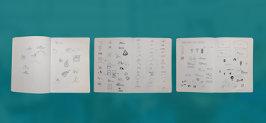
Over a period of 3–4 months I worked on dozens of logo concepts. In this early stage I was throwing the net wide and trying out a whole range of ideas to see what felt right. It was trial and error, and anything was possible, so I continued to sketch and sketch and sketch.
Because New Horizons didn’t have a strong visual icon to design around (a leaf, or a river, or something like that!), the concepts were based on more abstract ideas, which was both freeing and challenging! But as I continued to try out different concepts I realized that I was repeatedly coming back to some core ideas:
Lines converging
A beacon concept
A pathway toward a destination
The horizon line
I took a set of 4 logo concepts based on these ideas to the brand working group, along with examples of how each concept could be extended into a design system. Immediately it became clear that one of those concepts, an upright rectangle icon with a mountain/pathway shape within it, was the one to develop.
This was an exciting stage in the process and it really felt like we were heading in the right direction… but many months of precise tweaking were ahead!
Step 3: Iterate, iterate, iterate
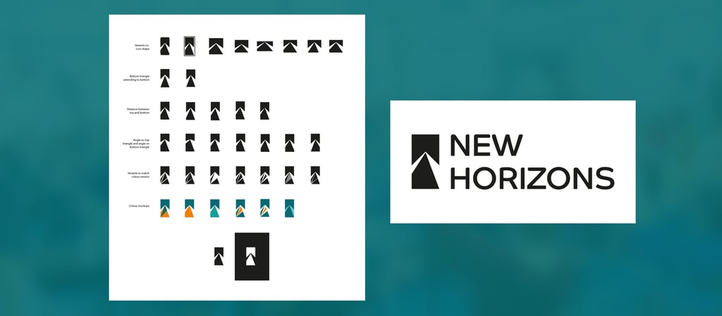
Over the next few months I started to work with the rectangle icon, stress testing it to see how it worked in different lock-ups, at different sizes, in different colors and against different media.
Through this process I discovered that the rectangular shape of the design actually created a variety of limitations around how it could be used. I still felt the general concept was strong, but I was finding the shape was not conducive to a multi-media and multi-platform brand.
So I started to stress-test the shape of the icon itself, adjusting the height and width of the icon to see what was the most flexible.
I found that a square shape (or just off square) was much more flexible in a variety of formats and media, than a rectangle was. But when I changed the shape from a rectangle to a square, the inner ‘mountain/pathway’ no longer worked as well. So I shifted the perspective of the path to the right, and this worked much better as a design and started to communicate more clearly the idea of forward movement toward a destination.

I took this new design to the brand working group, but we didn’t feel we were quite there yet.
Not settling for OK
I continued to work on version after version of the icon, tweaking and adjusting the perspective and angles. The challenge was to keep the simplicity while making sure the icon communicated everything we wanted it to.
I had a meeting booked with the brand working group to look at new versions of the icon… but I didn’t feel we were 100% there yet.
So, I put aside all the work I'd done up to this point, and went back to the original concept brief and re-looked again at the icon, playing with the shape, flipping it over, adjusting angles in an extreme way… just to see what would happen! It was work I thought I wouldn’t show to the working group, but I wanted to make sure I'd done everything I could to look at other options so I could be confident in proposing the final version of the icon I had prepared.
I met with the brand working group, and shared the final version of the icon and agreed between us on the one to take forward. But despite having come to a decision it still didn’t feel like it was ‘clicking’.
I wasn't willing to settle for ‘OK’, so I presented the other crazy ideas I'd tried out, just to see if any of them would prompt a different response.
Immediately one of the ideas, a variant on the icon I'd been working on, but with the ‘road’ leading all the way up into the corner of the square, stood out to everyone in the room.
There was a sense of ‘this is it’.
As we all looked at this new icon we started to see different shapes and visuals within it. The icon started to take on greater meaning and brought together many different strands that had been in the original identity work, but were now manifesting themselves in the icon.
The 3 images that became clear within the logo icon, which represented the journey of New Horizons but also its trajectory into the future, were:
Light descending from the Upper Realm
We are a community that is built upon the word that comes from God; everything you see has its origin within the mind of God. His voice is our aesthetic and the only motivator and catalyst for everything we do.
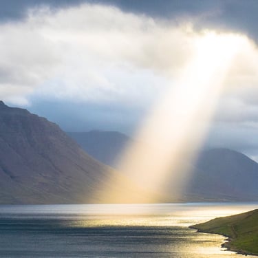
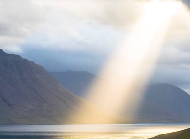
Movement towards a single destination
We are on a journey. The journey is progressive as we move step by step and God reveals the new horizon in front of us. It is a journey characterised by God’s speaking and His light shining into our lives as we move toward the destination which is Christ and coming home to Him.
Our lives, our relationships and our commitment to God broadcast a frequency that is powerful in the spirit realm. Like a beacon, we shine light into the darkness, but we are also a place of sanctuary where those trapped in darkness are able to find their way into safety and restoration.
A beacon heralding the restoration of all things


Step 5: Creating a system
Of course, the logo is not the brand. Now we had a great icon that felt representative of who New Horizons was, and will be, but we needed a design system that could wrap around the logo and provide the platform for others to build on.
It was at this point that all the time invested upfront in the developing of a clear brand concept and identity paid off. I already knew what we were going after, and had kept it in mind throughout the design process for the logo. So now I just needed to put words to what was already built into the process.
Determining the brand color palette
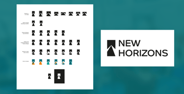
The core colors of the brand came quickly — the blue carrying over from the previous logo (to maintain consistency and show progression from the old) — the flash of orange drawing from the color palette of Congress WBN (a network the church is a part of) and representing dynamic movement.
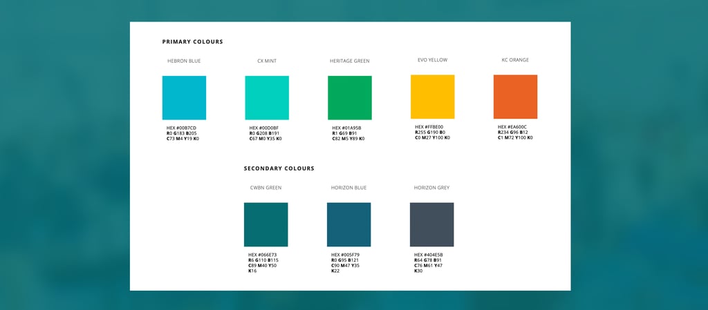
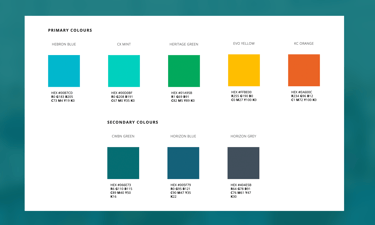
I then developed a set of primary colors that matched the vibrancy and energy of the orange in the logo. These colors were each linked to one of the people groups in the church.
As I developed the color palette, I also developed a system for how those colors should be used. Again, I went back to the original intentions and goals for what the brand should achieve, and therefore simplicity and empowerment were the key. That’s why I developed a color system where just one primary color should be matched with any of the secondary colors. By keeping the ‘rules’ simple, it empowers everyone to be creative and use the system with the safety that if they follow the system their designs or media will look great!
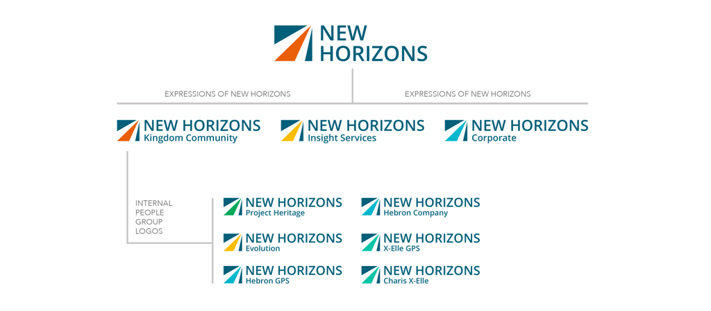
The logo architecture
The cumulative result of this meant I was able to replace the highlight color in the New Horizons logo with each of our primary colors and add in the title of each people group. This created a logo architecture that was cohesive while giving each people group a unique identity — a brand that is simple at its core yet allows for complexity and multifaceted expression.
Identifying the brand principles
The final step was to identify a set of design principles. These principles guided the creation of the logo and came out of those initial discussions, but now I crafted them into principles that could empower others to take the brand and create media that would look and feel like New Horizons.
Step 6: Giving the brand into the hands of the people
The New Horizons brand was always intended to end up in the hands of the members of New Horizons. It would not be enough to have a brand that worked well but needed specialist designers to actually implement — the brand had to be simple enough for anyone to pick up and work with.
Part of making this possible was to provide clear and simple guidance that could evolve and develop as the brand was implemented. A static brand guidelines document wouldn’t have worked, as it would have become obsolete soon after it was released. We needed a way of giving everyone sight of how to use the brand, but to also show them the ‘why’ behind the brand in a simple and ‘non-technical’ way.
That’s why I created a Brand Portal for New Horizons.
This web interface gave me the opportunity to lay out everything that would equip anyone to take the brand and work with it. That person needed to understand the architecture and thinking that shows why the brand is how it is. That person needed to understand the colour system and know how to use the logos appropriately. And finally that person needed access to up to date assets and templates so they could be confident in knowing they had the most current information and resources to utilize the brand effectively.
The Brand Portal was designed so that content could be added to it and the guidance could evolve as New Horizons moves forward.
A new brand for a new era
The new branding for New Horizons was launched in November 2019, a full 15 months after initial discussions began on the project. It was a long process, but the timing was perfect as the new branding launched at the start of a new era of development for New Horizons as a church community.
Here's what members of New Horizons had to say...
"This isn’t like a rebrand of a company just to keep things interesting. It comes out of a clarity of who we truly are, and makes our outward interface more accurate.”
“I love this! This is something the children and young people will be able to describe, understand and take hold of. The brand will be a reminder of who we are.”
“Now we have a brand that people can own, people can be proud of and reminds us of the shape God has given us as a community."