Simplifying Search for University Agents
12/2/20245 min read

Role: Product Designer, UX Manager
2023 - 2024
Team:
UX Writer
Developers
Business Analyst
Solution Architect
Summary: International agents struggled to search for student applications in Coventry University’s portal. Collaborating with developers, I delivered an innovative filtering solution using existing functionality. This approach met user needs, aligned with business goals, and delivered results within tight timelines, improving agent workflows and supporting recruitment efforts.
Context
Coventry University attracts thousands of international students, with many applying through local agents who are crucial to its recruitment efforts. The university's bespoke Partner Portal enables agents to submit and manage applications, playing a key role in driving enrollment and supporting a vital revenue stream.
Understanding the problem
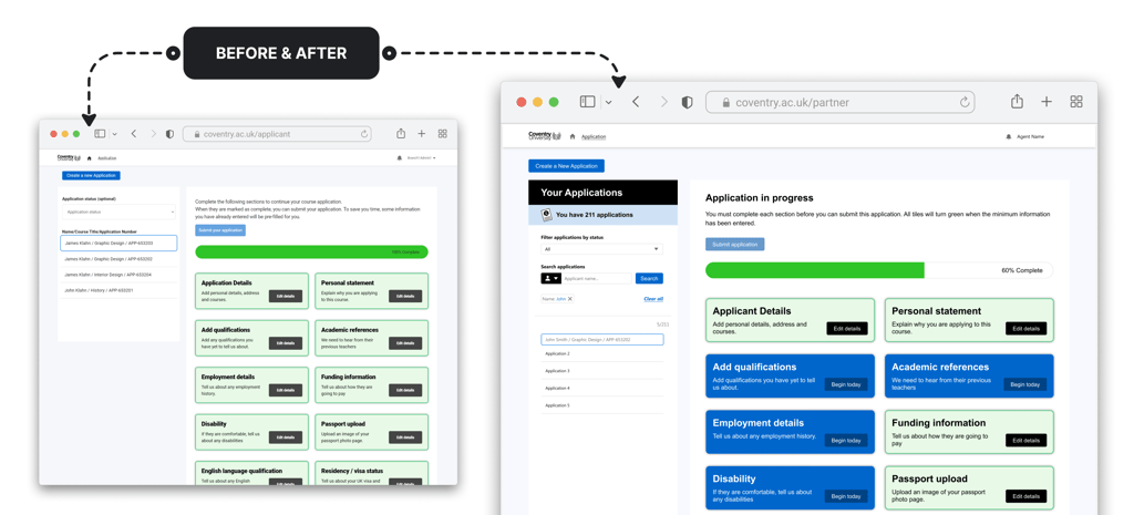
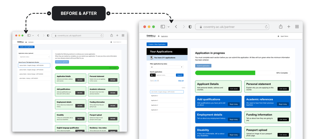
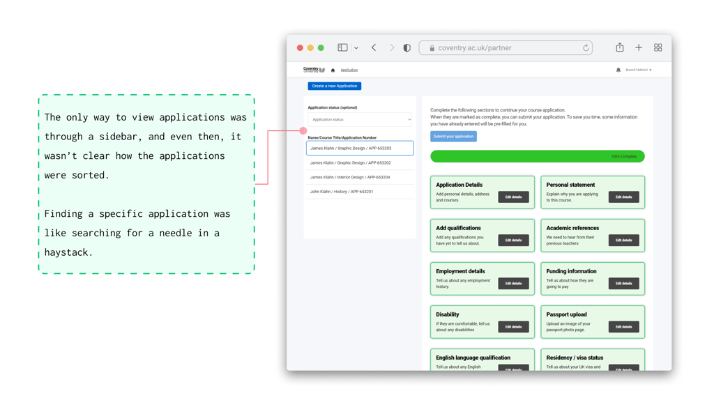
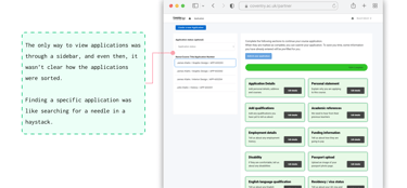
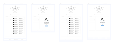
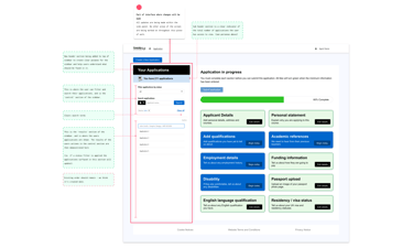
Agents using Coventry University’s Partner Portal were frustrated. The only way to view applications was through a sidebar, and even then, it wasn’t clear how the applications were sorted. Finding a specific application was like searching for a needle in a haystack.
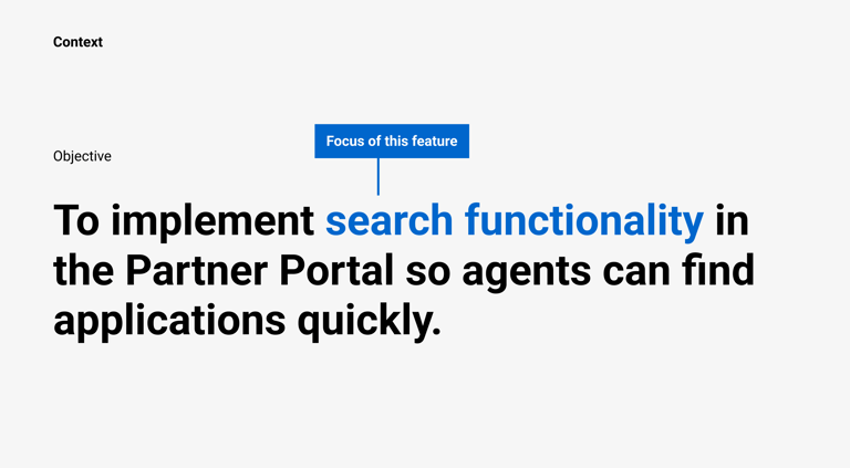
The initial brief was simple: "We need a search function."
My immediate response was: "What kind of search function do users want?"
I advocated for the importance of user research to gain a clear understanding of user needs, behavior, and to effectively measure impact post-delivery. However, due to time constraints, the busy season for agents, and a lack of alignment within the organization on prioritizing research, I was asked to move forward with the project without the intended user insights.
Without direct access to users for research, I had to dig deeper into the problem using secondhand information about user needs.
So, I made some educated guesses:
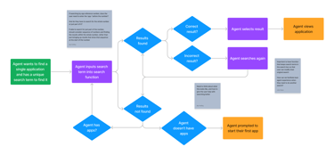
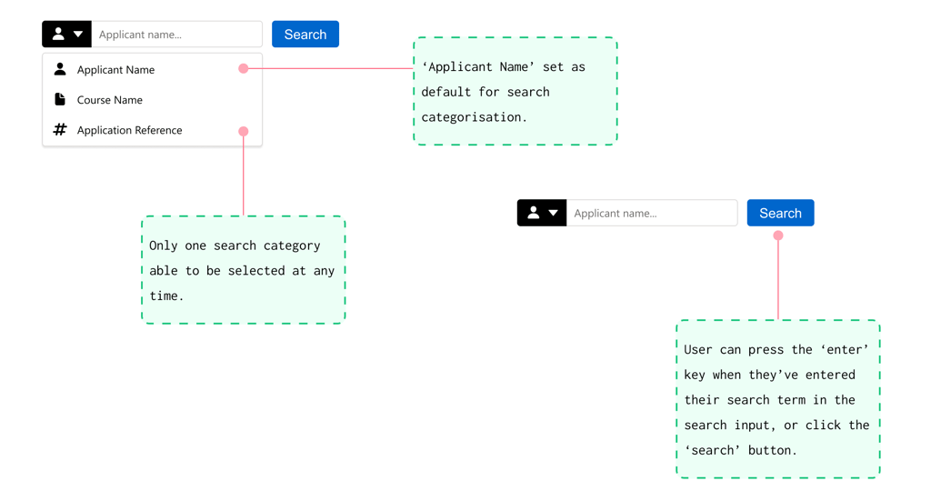
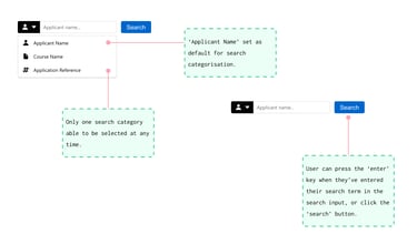
Agents are usually looking for specific applications and want to search by things like a name, course, or application number.
Starting with exploration
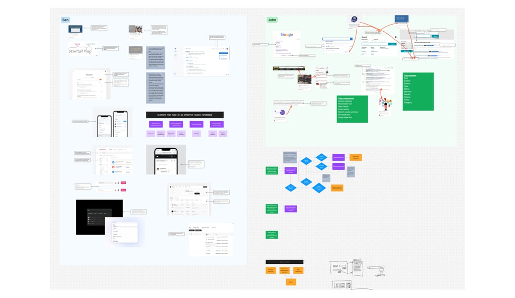
To kick things off, I looked at how other systems handle search. Through desk research, I identified patterns that make a good search experience—things like intuitive filters, clear sorting options, and fast results. I also sketched out user journeys to map what the ideal process might look like, helping get a clearer sense of what agents might need.
Despite this groundwork, there were still plenty of unknowns. The system was built on Salesforce, and I didn’t fully understand the technical setup or constraints in relation to search functionality.
I reached out to a Solution Architect to bridge that gap.
These conversations revealed some surprising challenges:
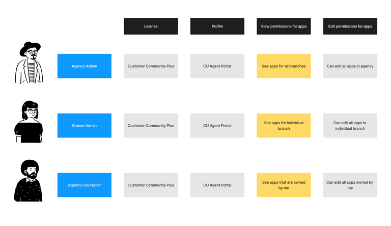
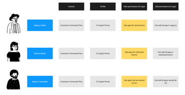
There were actually 3 user types for the Partner Portal, and we needed to consider each type and each of their slightly different needs.
Salesforce offered various search options, but each came with trade-offs—custom solutions were powerful but complex, while off-the-shelf components were quicker to deploy but less flexible.

With a better understanding of the problem, I started designing—not final solutions, but conversation starters. The goal was to bring the Solution Architect into the process and uncover potential technical roadblocks.

In the early stages of the project, I held design reviews with senior stakeholders and members of the product team to provide updates on progress and share the evolving solution.
Iterating the solution
Initially, I hoped we could create a simple, out-of-the-box search experience. But after several discussions, it became clear that wasn’t feasible. A fully customized solution would take too long, and the off-the-shelf option had too many limitations.
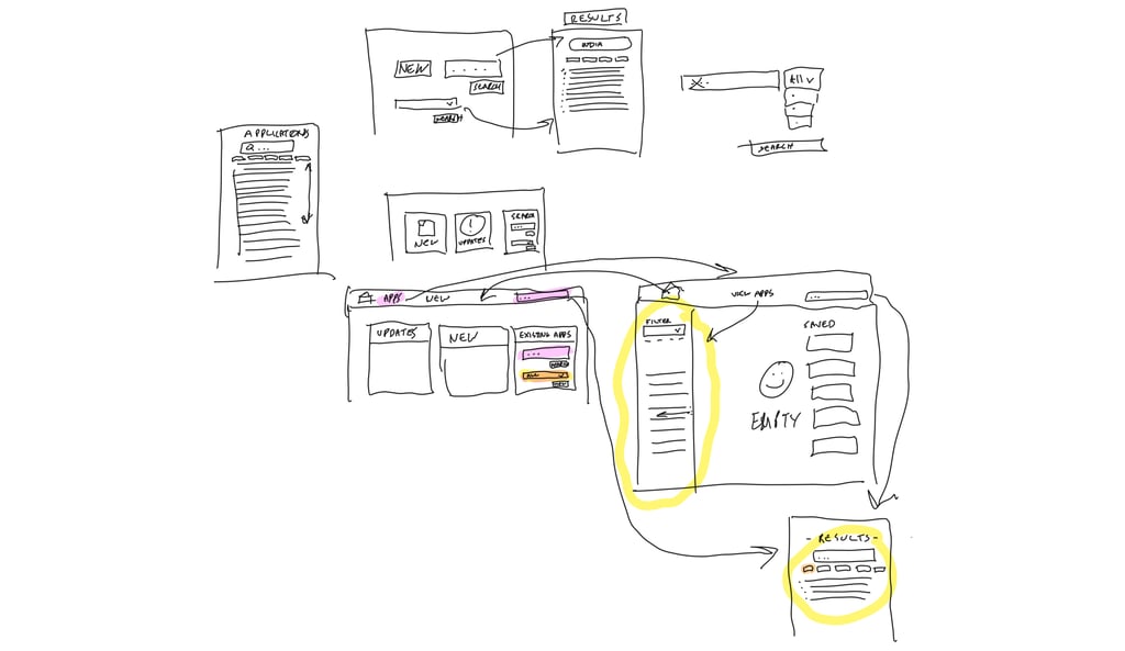
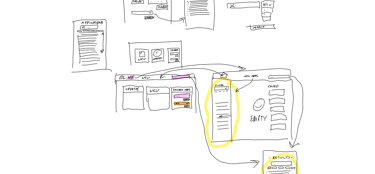
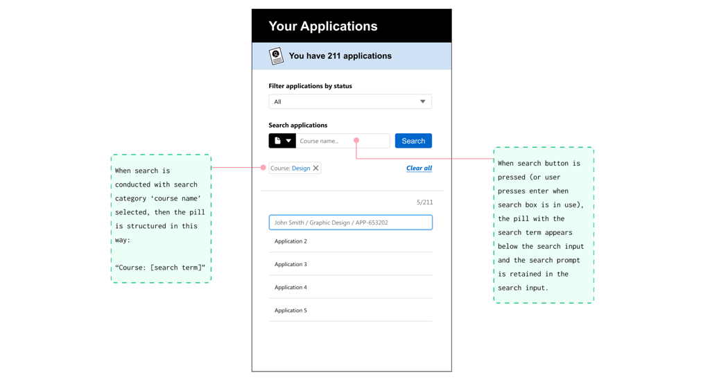
This led us to an alternative: instead of building a full search function, we could use filtering to mimic the experience of searching.
This approach would allow agents to narrow down results by criteria like course or application number, using data already loaded into the system. It wasn’t the perfect search experience I'd imagined, but it was fast, user-friendly, and achievable within the constraints we had.
Designing for real users
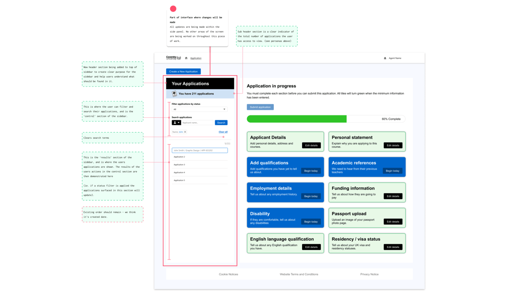
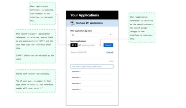
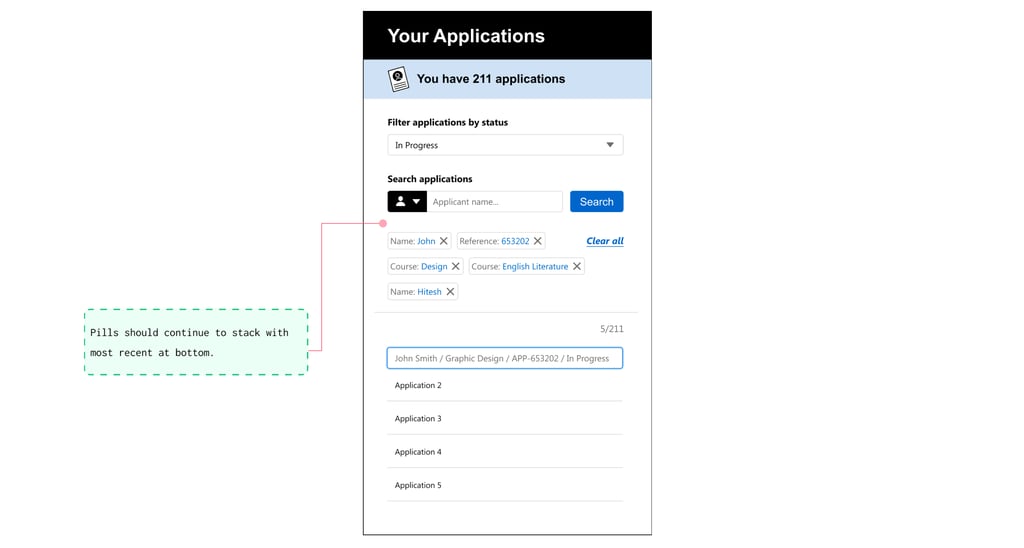
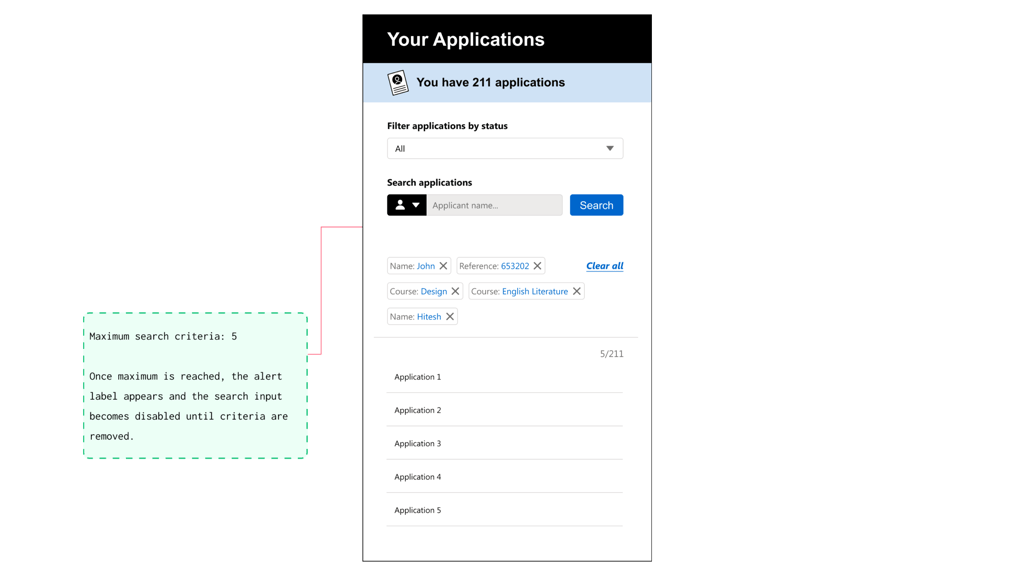
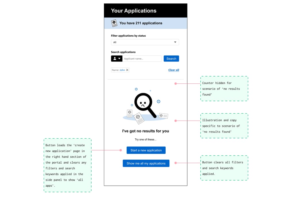
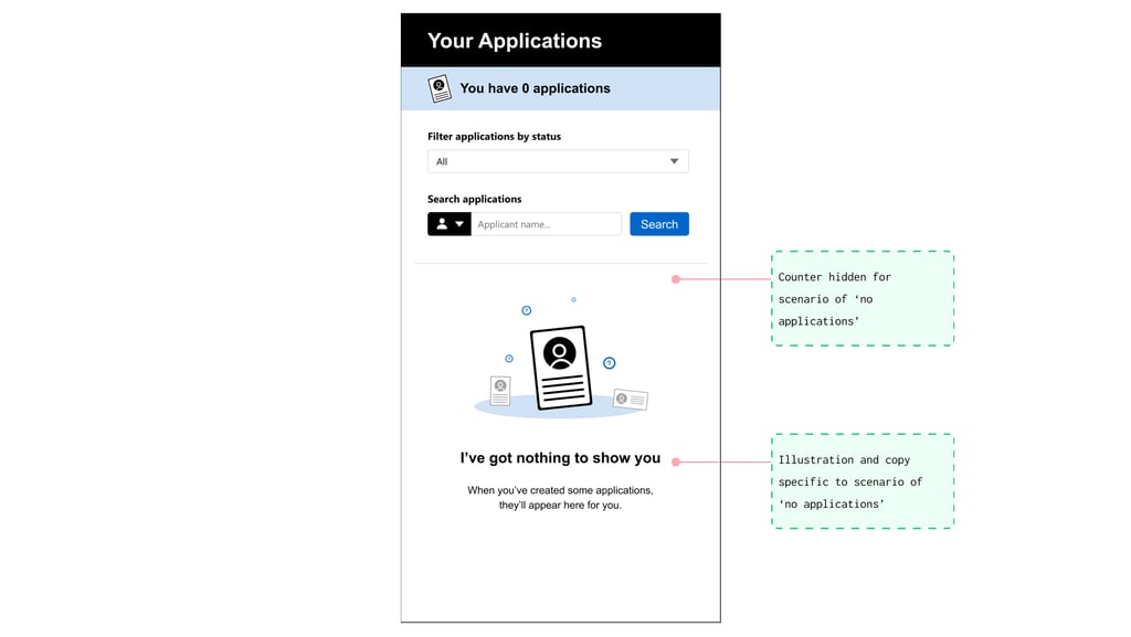
With this direction in mind, I refined the designs to focus on usability and clarity. The filtering feature was integrated into the sidebar, a space agents were already familiar with. I added small but impactful touches, like showing the total number of applications and clearly displaying active filters, which users could remove with a single click.
As the developers started building, the designs continued to evolve. For example, my initial plan was to load all applications by default, giving agents the full picture right away. But during load testing, we found this caused performance issues for larger agencies with thousands of applications. We adjusted the default to show only the most recent 5,000 applications. While this wasn’t perfect for every user, it dramatically improved load times for the majority.

Rolling it out
Once the functionality was ready, I realized there wasn’t much of a plan to prepare external users for the change. To fill this gap, I created a simple user guide explaining the new feature and shared it with the sales team, who distributed it to agents. This ensured that users knew what to expect and how to use the updated portal.

The outcome
The new filtering functionality was successfully delivered within 8-12 weeks, giving agents a much-needed tool to find applications by name, course, or number.
While I wasn’t able to measure the impact formally (the organization didn’t prioritize research to assess outcomes), feedback from the sales team suggested that agents were relieved and grateful for the improvement. They could now find applications faster, saving them time and reducing frustration.
On a broader level, this update supported the university’s goal of increasing international student recruitment. Agents play a key role in this process, and making their job easier directly contributes to the university’s success.