Revamping Coventry’s Self-Service Platform
12/7/20245 min read


Role: Product Designer, Project Lead
2023 - 2024
Team:
UX Writer
UX Researcher
Technical Writer
Developers
Business Analyst
Product Owner
Product Manager
Solution Architect
Salesforce Architect
Summary: The Wayfinder project reimagined Coventry University’s self-service tool to enhance the student experience. By addressing technical limitations, centralizing knowledge, and improving usability, the project reduced support inquiries, streamlined navigation, and ensured scalability for future features. It built on Wayfinder’s success, creating a responsive, intuitive platform that empowers students and supports university growth.
Setting the Scene:
A Strong Start, Ready for the Next Step
Self-service tools are a game-changer for any organization. They empower users to find answers to their questions independently, reducing the strain on customer support teams and boosting satisfaction through quick problem resolution.
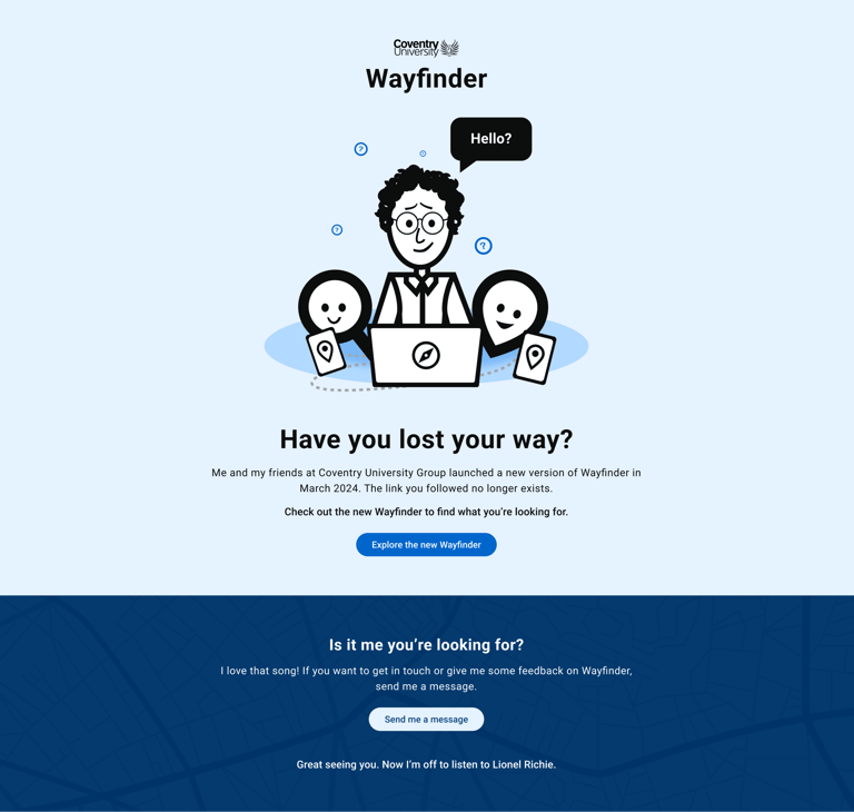
When I joined Coventry University, their existing tool, Wayfinder, had become a key part of student life, reflecting the hard work and commitment of the teams who brought it to life. It gave students a self-service tool to find answers independently, easing the burden on support teams and improving the overall experience.
However, the platform had outgrown its original setup.
A problem that couldn't wait
Wayfinder wasn’t officially supported, relying on the expertise of just one individual to keep it operational. Content management posed another challenge, with staff updating information in multiple places to ensure consistency between Salesforce and Wayfinder—a time-consuming process prone to errors.
Beyond these immediate issues, the platform lacked the foundation needed to support the university’s ambitions for a next-level customer experience. Features like chatbots, live chat, and personalized logged-in experiences were out of reach without a more unified, scalable solution. The time had come to rethink and rebuild Wayfinder into a system that could meet both current needs and future aspirations.
Setting the stage for change
The stakes were high. The university needed a robust product to replace the unstable platform, centralize content in Salesforce CRM, and reduce student frustration caused by unclear information.
On the user side, students were already using Wayfinder as a central source of truth, and the new solution needed to continue to:
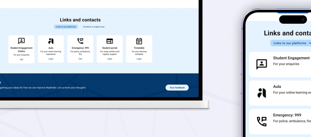
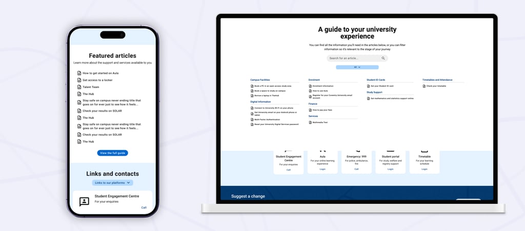
Quickly answer their frequently asked questions (FAQs).
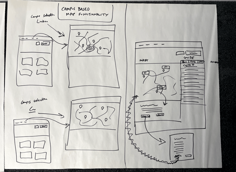
Deliver campus-specific information tailored to them.
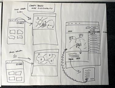
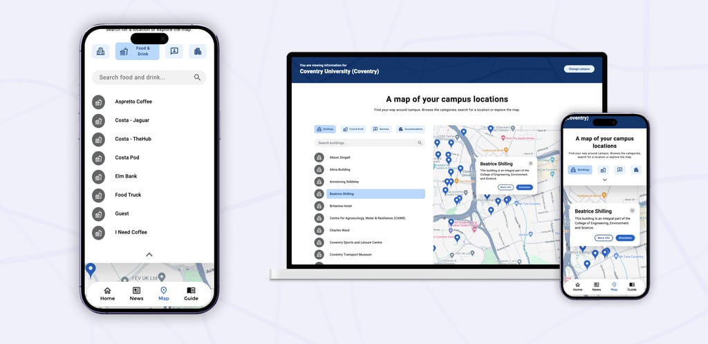
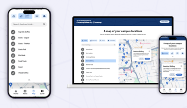
Help them navigate their way around campus, especially during hectic enrollment periods.
Guide them to essential services they might otherwise miss.

Getting to the root of the problem
Before we could design the right solution, we had to understand the root of the problem.
Collaborating with business analysts, I helped define the goals for the new product. I commissioned our UX researcher to dive deep into user data, uncovering insights from student feedback and common inquiries. Those insights were the foundation for identifying opportunities to make meaningful changes.
Crafting the vision
The goals for the new Wayfinder emerged from a cross-functional collaboration with solution architects, Salesforce experts, and analysts:
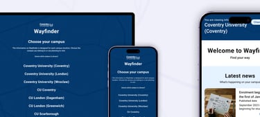
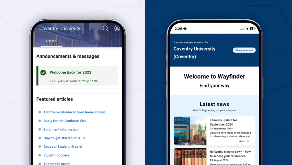
Mobile-first design
Students could easily access FAQs on their phones.
Relevant content
Information segmented by user demographics, such as campus location.
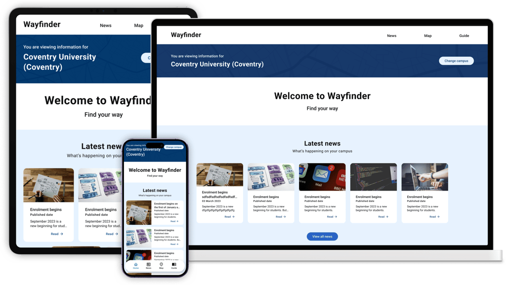
Intuitive navigation
A seamless and engaging interface with smart search functionality.
System integration
Leveraging Salesforce for a unified backend.
Scalability
A future-ready product that’s flexible and easy to maintain.
From vision to strategy
With clear goals in place, I worked closely with the solution and Salesforce architects to evaluate platform options. When the team produced a proof of concept, I reviewed it thoroughly, challenging assumptions and ensuring it aligned with our vision.
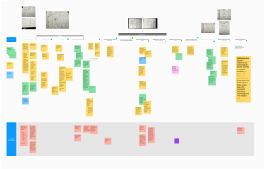
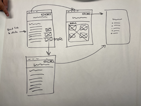
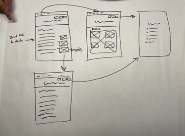
To prepare for design, I organized user journey mapping workshops and collaborated with the knowledge team to restructure the existing content both in Wayfinder and in the knowledge object in Salesforce.
We developed FAQ libraries, updated location data, and outlined student services with the help of the UX Writer and Technical Writer in my team. Together, we refined language and UX elements to ensure the product would be intuitive and engaging.
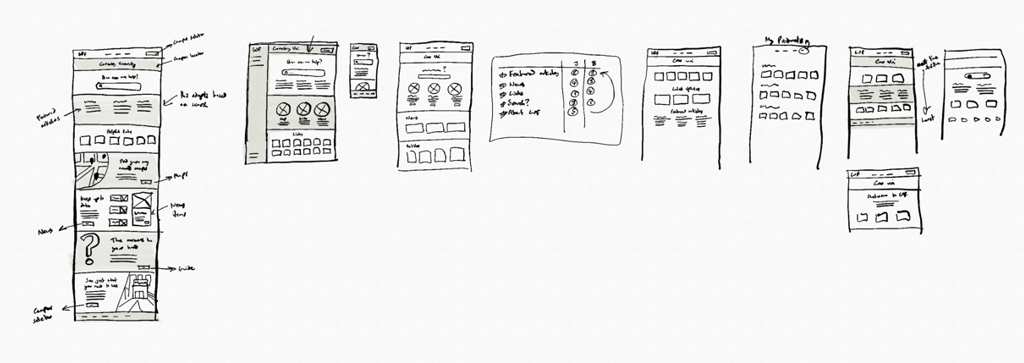
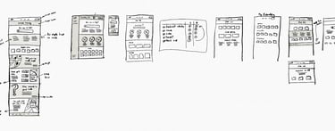
Designing an experience students will love
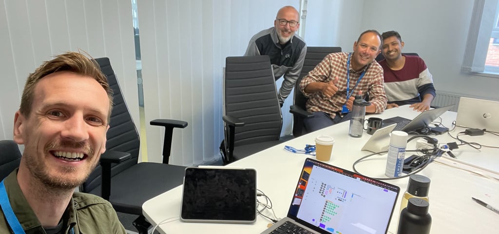
The real design work kicked off with a two-day solution workshop. In a room buzzing with energy, I facilitated discussions between architects, analysts, developers, and writers. By the end, we had sketched out a technically feasible user experience everyone was excited about.
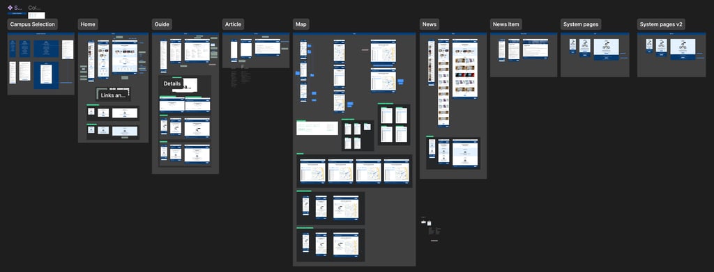
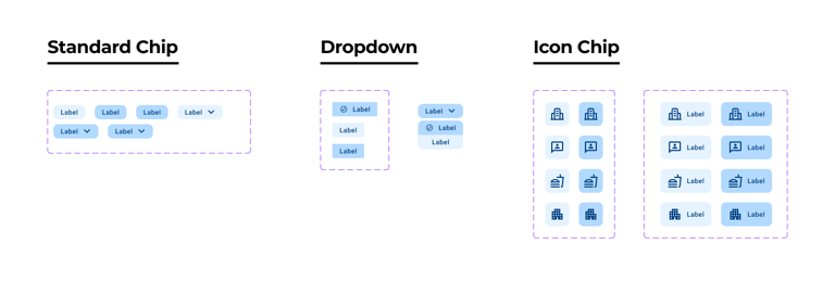
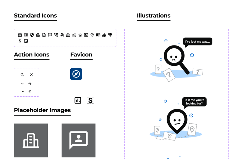
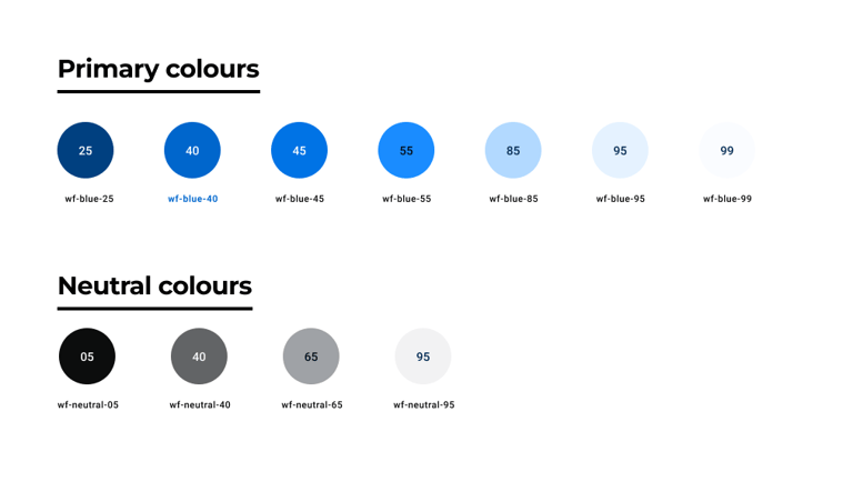
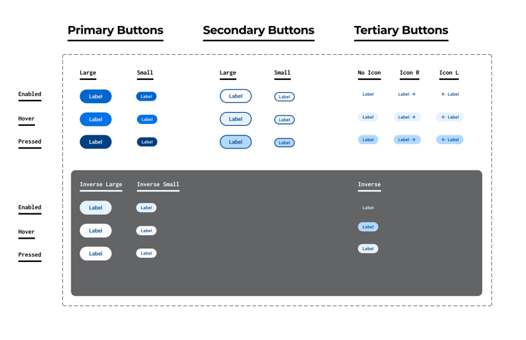
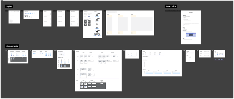
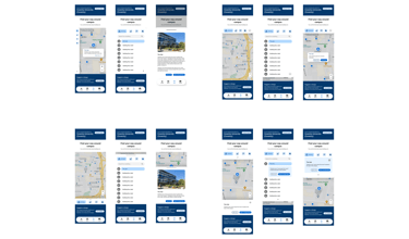
From there, I led the creation of a design system tailored for the product, collaborating with developers on design token structures to ensure seamless integration into code. High-fidelity mockups brought the vision to life, accounting for multiple screen sizes, interactions, and even the smallest details like empty states.
Bridging design and development
Design didn’t stop when development began. It evolved. As user stories were refined, I stayed closely involved, iterating designs to address technical limitations or new insights. I initiated weekly design reviews and technical check-ins, fostering a collaborative loop between design and development.
Over six months, this partnership resulted in a product that not only looked great but delivered on every product goal we set out to achieve.

Launch: A smooth transition
Launching a tool like Wayfinder isn’t just about flipping a switch. We rigorously tested the new platform in a sandbox environment before soft-launching it for real-world user testing. I worked with the release manager to create a detailed launch plan, including contingencies for any issues. Meanwhile, I partnered with marketing to craft clear student communications and briefed internal teams on the transition process.
The impact
The results spoke for themselves:
Improved Usability: A mobile-first, user-friendly interface with streamlined navigation and accurate, campus-specific content.
Operational Efficiency: A 39% reduction in customer inquiries and a 40% decline in IT account inquiries.
Internal Benefits: Simplified processes halved training time for new staff, and consistent content architecture empowered the knowledge team to focus on strategy.
Future-Proofing: The platform laid the groundwork for next-gen tools like live chat and chatbots.
Above all, Wayfinder restored students’ confidence in the university’s ability to meet their needs. By turning challenges into opportunities, the project demonstrated how collaboration and adaptability can transform a critical service into a source of pride.